All of Us
Breaking down structures to build a brand made for diversity.
Background
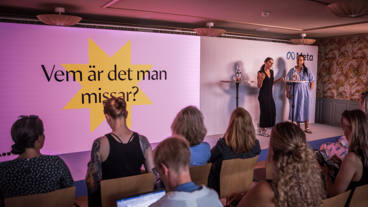
All of Us is a diversity network working to promote non-white people working in the creative industries. They help companies and organizations like H&M, Google and Universal Records work towards being more inclusive as brands and employers, by holding workshops, tailor-made training and acting as advisors. As their commitments are increasing, the need for a new brand became apparent.
Solution
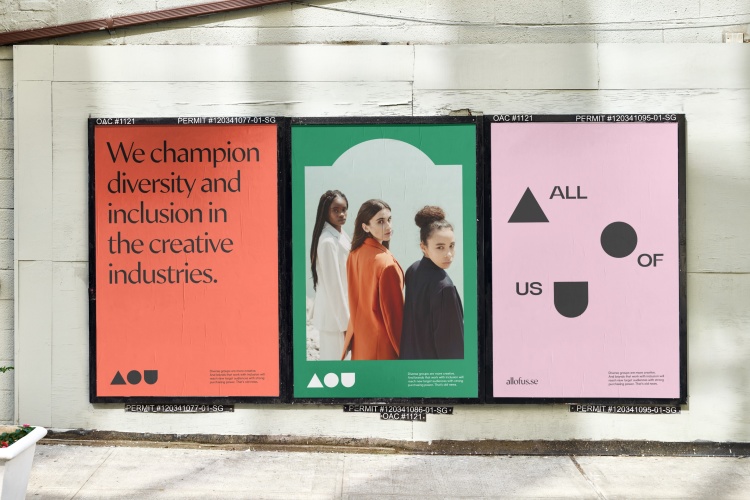
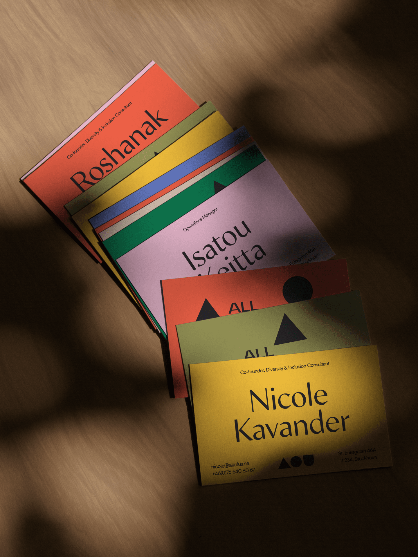
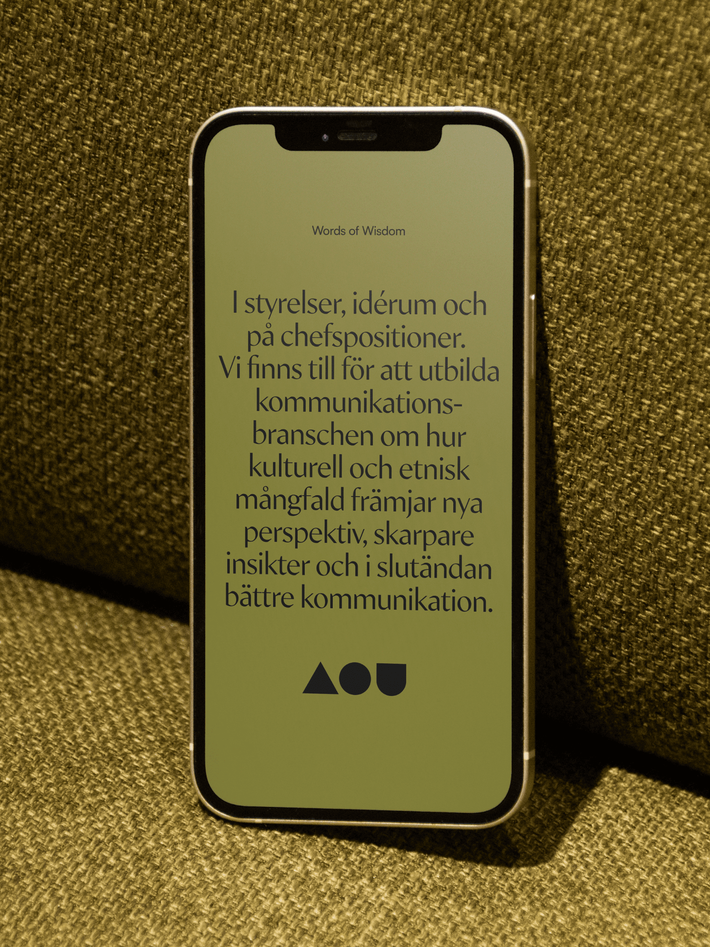
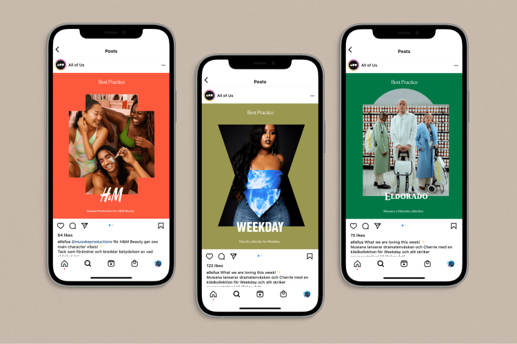
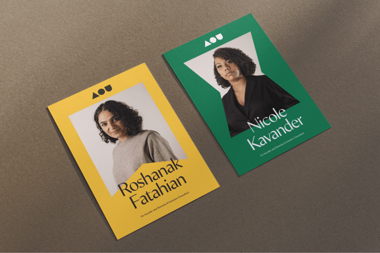
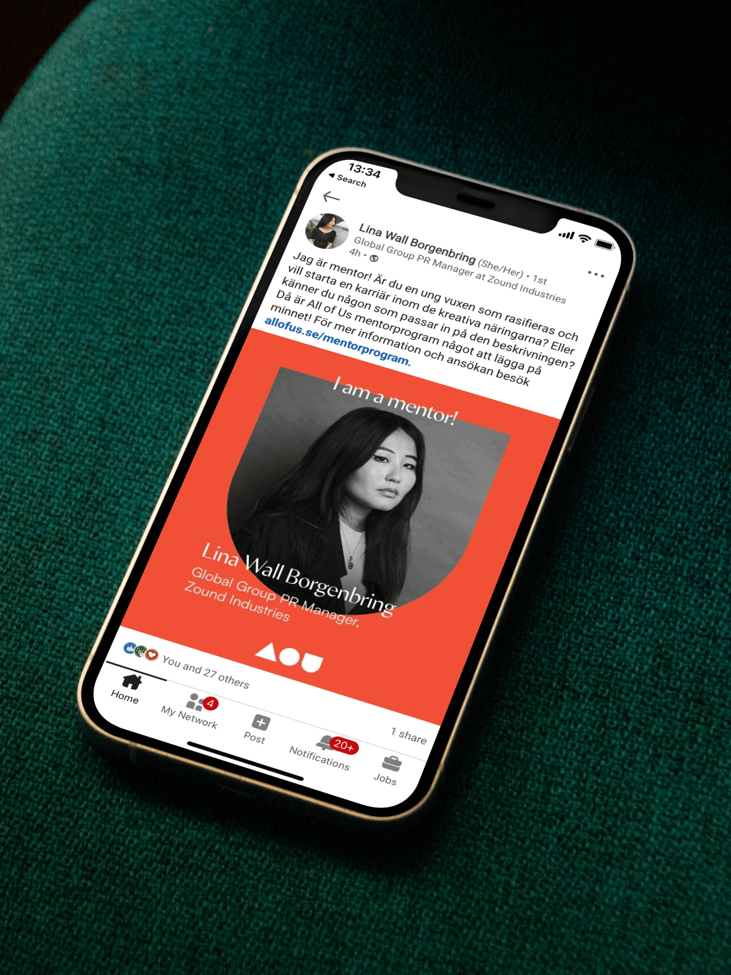
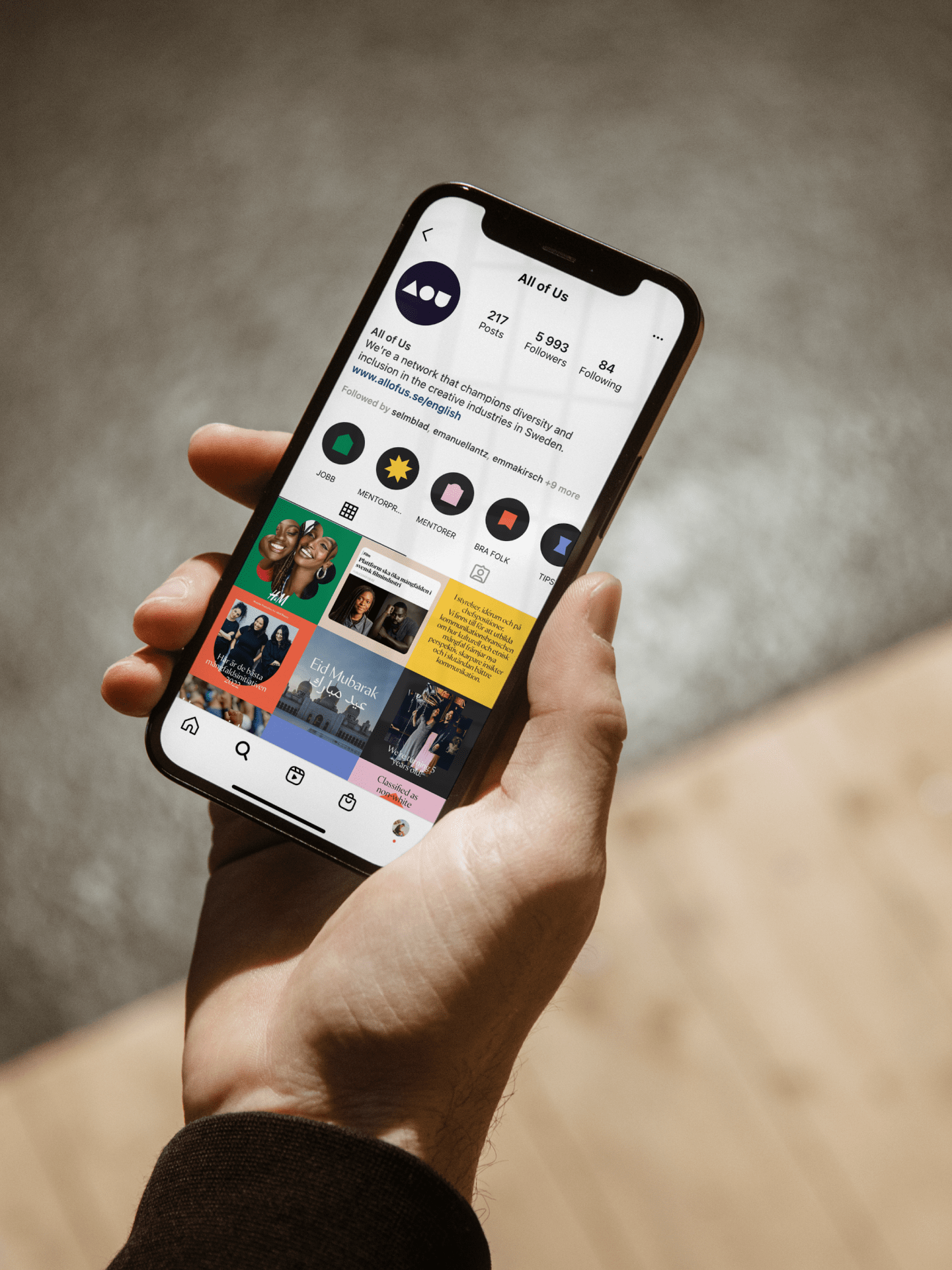
All of Us aim to change the structures and views on how talent fits into society, rather than changing the talent. “You can’t fit a square peg in a round hole” became the guiding notion, shaping the logo into rudimentary forms, while spelling out the initial letters. The logo became the starting point for an inviting and dynamic brand, with an expressive visual identity, using shapes and colors reminiscent of those found in many cultures, without appropriating. The typefaces Min Sans and Satoshi are drawn by non-white typeface designers Tien-Min Liao of Typeji and Deni Anggara of Indian Type Foundry.


Credits
Type design, Min Sans: Tien-Min Liao, Typeji
Type design, Satoshi: Deni Anggara,Indian Type Foundry/Degarism
Get in touch.
If you want to work with us or have us work for you, we’re always up for a chat and a coffee.
Contact
hello@okto.co
+46 8121 355 81
Visit
Sankt Eriksgatan 46A
112 34, Stockholm
Park here