Oatly
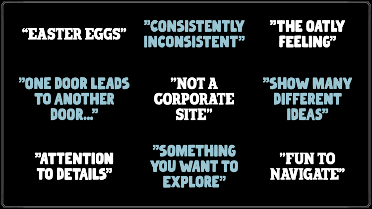
An online infinite canvas for a consistently inconsistent brand.
Background
Oatly is a brand known for their creative approach to marketing rule-breaking. They excel in that. Unfortunately, their .com-experience hasn't allowed them to execute the same level of creative freedom online, and consistently across markets. So how do you build a global online presence for a brand that is famous for being consistently inconsistent?
Solution
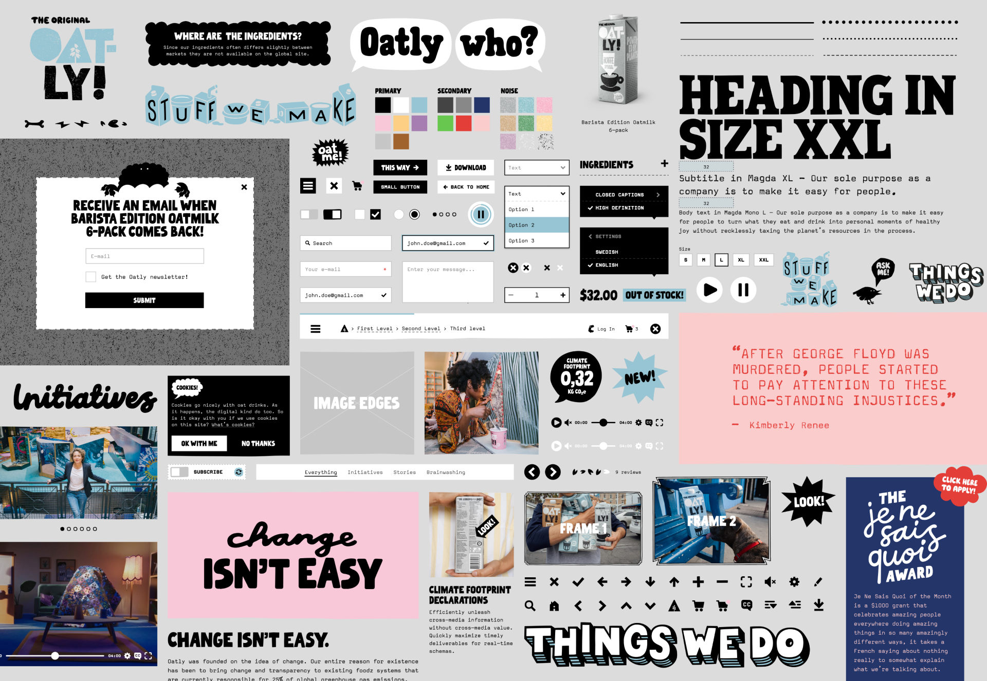
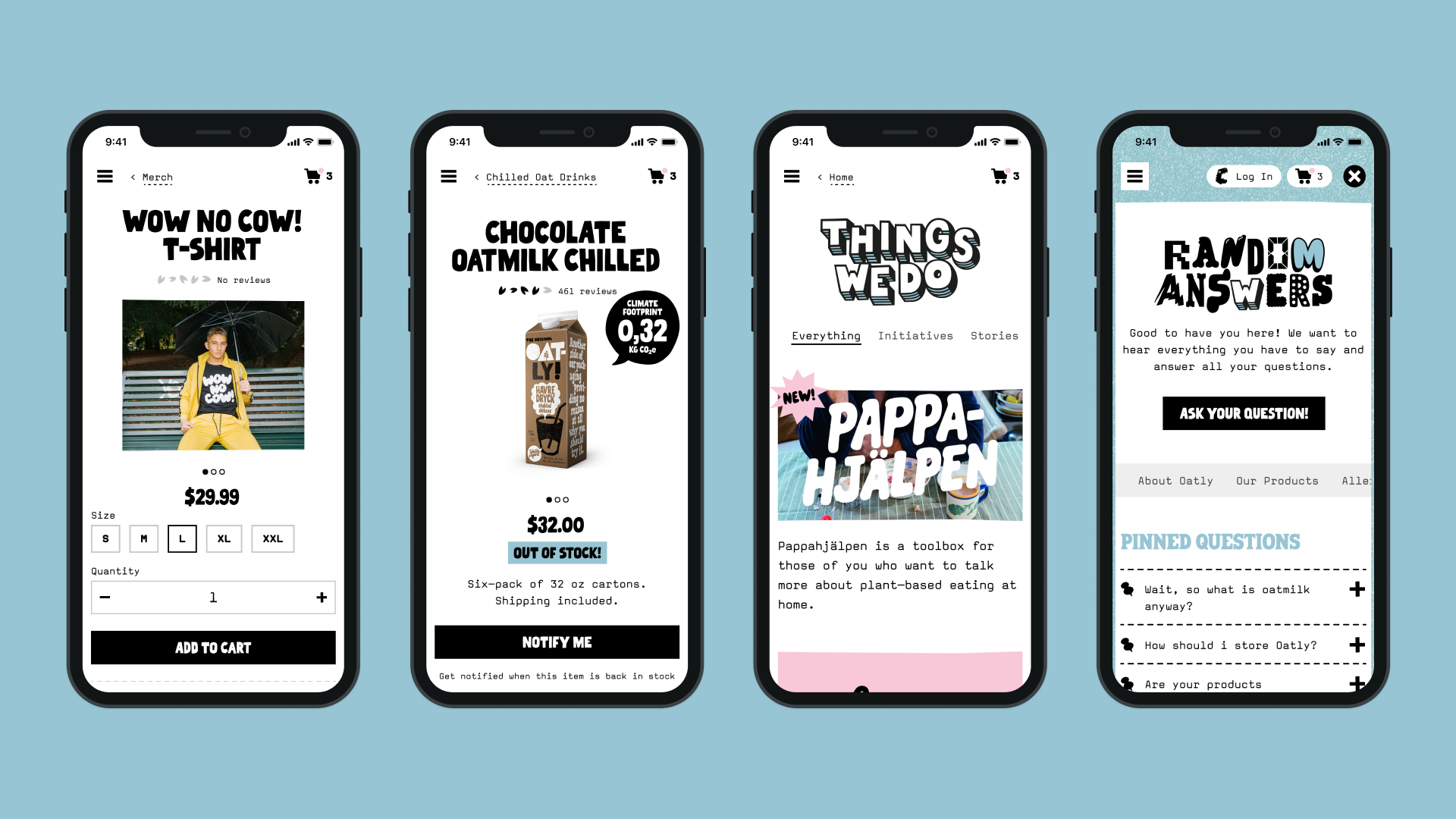
Creativity first, the heavy tech later. The Oatly Infinite Canvas is a portal into the Oatly world of hard facts, important info, oat milk business and of course – nonsense.
It is a canvas built to serve the every whim and spark the Oatly Department of Mind Control can conjure up – ever-changingly random with a super-gridded system, a highly irregular experience with a clearly boxed in back-end. An experience built for creative freedom, that encourages exploration and just like the brand itself breaks the rules for how marketing “should be done”. A seemingly overwhelming amount of content? NO! (Yes.) Scrolling horizontally? NO! (Yes.) Changing the navigation between the sections? NO! (Yes.) A gigantic hand-cursor easter egg? Why not?
The Oatly Infinite Canvas is a place where a brand that employs full creative freedom in the real world now also can do it online, again and again and again.


Awards
- Red Dot Design Award – Web Design – Best of the Best
- The Webby Awards – Best Homepage – Winner
- The Webby Awards – Corporate Communication – Honoree
- The Webby Awards – Best User Interface – Nominee
- The Lovie Awards – Best Homepage – Winner
- The Lovie Awards – Best User Experience – Winner
- The Lovie Awards – Best Food & Beverage – Silver
- Cannes Lions – Design – Shortlist
- The Oneshow – Digital Design - Merit
- Awwwards – Honorable Mention
Get in touch?
If you want to work with us or have us work for you, we’re always up for a chat and a coffee.
Contact
hello@okto.co
+46 8121 355 81
Visit
Sankt Eriksgatan 46A
112 34, Stockholm
Park here